Responsive design. It’s the latest buzzphrase (I don’t even know if “buzzphrases” exist, but if they did, this would be one) in anything to do with web design at the moment. So what exactly is it, and why should web designers and their clients care about it?
Well, back when I was coding up my first websites a few years ago, you could be pretty sure that if you were doing a fixed layout site (i.e. it doesn’t change size with a bigger monitor) and you set your minimum width to 750 pixels you’d be ok. This was back when 20% of people still had monitors with a resolution of 800 x 600 pixels, so you had to cater for them, removing a few pixels for scrollbars and screen edges. Then, using the BBC news website as a good guide of when to change (in this case June 2009), that increased to a width of 1000 pixels as the majority of end users had monitors starting at 1024 x 768 pixels.
This resolution seems to have stuck as a kind of standard for desktop / laptop machines, with companies developing separate versions of their sites for mobile phones. This was often found at m.mycompanydomain.co.uk, with an automatic redirection to that version of the site if it detected a mobile being used, often with fewer graphics so that loading times were faster. But hang on, what if I tether my phone to wifi – I still want to see images on a site. What if actually my mobile device is an iPad…I might want to see the normal website, not some cut down functionality design for a much smaller screen.
Step in responsive design – an idea that’s been around for many years, but just not badged as such. One version of the data behind the site, several different “views” of it for different sized screens, and a controller to determine which view should be shown. To geeks such as me, we know this as MVC coding – model, view, controller. When a site detects what type of device is accessing it, a different stylesheet can be served up. The site might work off the user agent (i.e. details of the machine and browser), or maybe the number of pixels available in the browser window. The code stays the same – just the CSS changes.
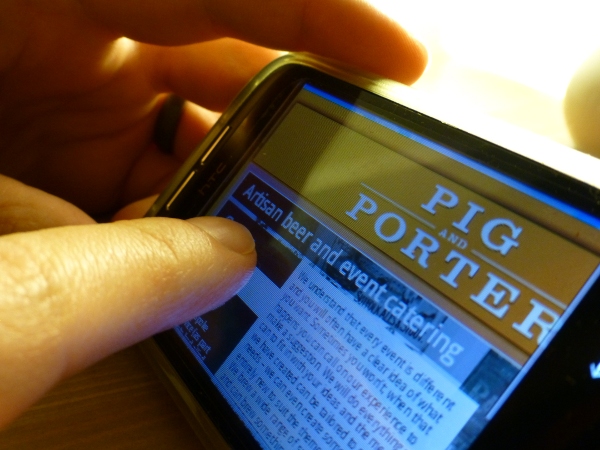
So is it just about what it looks like? Well, partially, but it’s also about usability (as alluded to in the title). As people who have used Windows 8 (designed to work with a touchscreen) with a mouse will know, you have to design differently depending on whether a mouse or a finger is being used. Buttons and links have to be bigger if you want a finger to select them (guidelines suggest a minimum of 44 x 44 pixels) and gone are the days of using “a:hover” to have a different effect when hovering over something. Now don’t get me wrong, the hovering functionality still works with a touchscreen (for instance on the home page of pigandporter.co.uk, you can instead click on the headings of Quality, Flexibility and Reliability), but you can’t rely on a hover of a mouse to inform the user that they should click.
All this is great for end users when implemented correctly – they visit the same site from different devices and have a good experience of the content optimised for the method of viewing. It does, unfortunately, come with a price though in terms of extra web development required – the cost of a designing and implementing a couple of extra stylesheets, but I think it’s well worth it, especially with the statistics showing an increase in the number of users who access the web through mobile devices. And this site? We’re designing it with all of these things in mind.
2 replies on “Can’t touch this”
I was sent on a course recently that talked about this.
I hadn’t really thought a lot about it before (though I am a bit of a conservative when it comes to web-design) but to illustrate responsive design quite nicely take a look at : http://lessframework.com/ and resize your browser window, note how the website subtly redesigns itself based on what resolution it has available to it. Apparently this is a part of responsive design?
Spot on – it’s the essence of responsive design and something that I think all web designers should be thinking about! We’re thinking about it…but have yet to have enough time to implement it!