Categories
How to... Web Design

HTTPS by default

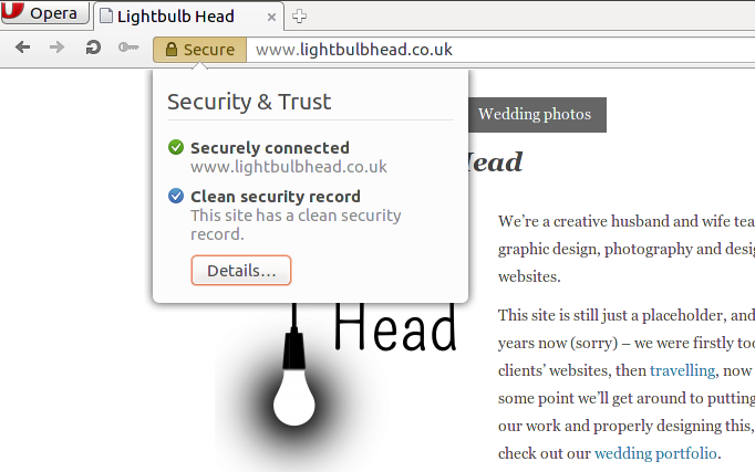
When you enter information into an online form, do you check for a padlock in your address bar? Would you have done the same 3 years ago? If there’s no padlock in your browser address bar, that means your data isn’t being transferred securely (in fact even if there is a padlock, it might still not be transferred securely… but that’s a different story). This means that anyone on the route between your computer and the machine hosting the website you’re sending data to could see said data.

OperaSSL

In the post-Snowden world that we live in, I think it’s fair to say that people in general are more aware of the information that they’re sharing online. But as a website visitor, you have very little choice as to whether your favourite website offers a secure version or not, which is why, I guess, Google have started to use the presence of a secure version of a website in their rankings – to encourage web developers to give their visitors a secure browsing experience. Obviously banks provide a secure version by default, as do most social networks and shopping sites, but small businesses may not and I think this is the group that Google are trying to appeal to with this move.

Excitingly, the move has coincided with Let’s Encrypt (an American charity working to “reduce financial, technological, and education barriers to secure communication over the Internet”) moving to public beta, and they’re offering free HTTPS certificates, which allow you to create a secure version of your site. As our hosting company, Dreamhost, have partnered with Let’s Encrypt there was no reason for us not to transition this site (plus our personal site and church site) across to secure versions, and it was much easier than I thought it would be for each domain:

  1. Register for the free certificate through Let’s Encrypt and install the certificate on the site
    Dreamhost made this easy for me and it was a one-click action for each site
  2. Check that visiting https://<domain name> works
    At this stage on each site, I got a padlock in the address bar, but with validation errors, as not all of the links within the site were referencing the secure version – only those which were relative links
  3. Fix all of the links
    Now this was the fun part – trying to fix all of the links. As all of the sites are WordPress sites, I went through the following stages:

    • Set the WordPress URL and Site URL in the admin panel to be https://<domain name>
    • Go through my theme files and replace full URLs with relative URLs (embarrassingly I found quite a few, which were very sloppy of me – the newer bits of the sites were better though, using “bloginfo(‘stylesheet_url’)” and “bloginfo(‘template_url’)” properly)
    • Fix links within content. Now I really didn’t want to add another WordPress plugin to each site to create redirects, which is why I was happy when I came across some handy information at CSS-tricks.com (step 6), which I nabbed and implemented. I was unhappy I hadn’t come across it sooner in the process!
  4. Set it so that visitors are directed to the HTTPS version of the site by default
    I added the following to the top of my .htaccess file for each site:


    RewriteEngine On
    RewriteCond %{HTTPS} !=on
    RewriteRule ^(.*)$ https://%{HTTP_HOST}%{REQUEST_URI} [L,R=301]

  5. Tell Google
    The final step was to add the HTTPS version of each site as a new “property” in the Google Webmaster Search Console

All in all, about half an hour per site, once I’d done a bit of faffing around.

Be safe online, kids.

Categories
Web Design

SEO common sense

Search engines are one of the sets of rulers of the world wide web. I think that’s a fair statement, but happy to hear any counter-arguments. Ever since the dawn of the web, content producers have been trying to get content consumers to visit their sites. We seem to have passed the heyday of directories and categorisation (RIP GeoCities) and are firmly rooted now in an era where “Google” is almost synonymous with “the internet” for many people. Do you want to find a picture of a kitten? Ask Google (or ask Bing, or ask Jeeves or Lycos (yes, it is still around!) or DuckDuckGo…). That is unless your friends on your social media platform of choice have already directed you there, but I’ll ignore that, as the focus of this blog post is on search engines and SEO (search engine optimisation). You want to find a local plumber? I’m guessing that asking a search engine might be one of the options you consider.

Let’s look at this from the other side now. You are the provider of a service; maybe you’re a plumber, maybe you’re running maths workshops. You are aware that people are looking for plumbers and maths workshops via search engines; how do you make sure that your details feature as one of the top results? Before I go any further, I should say that I am not an SEO expert and therefore you should critically evaluate my musings on the subject before taking any action based on what I’ve written here. Back to the matter in hand; you’re running maths workshops and you want people to know about them.

It’s no surprise that I’ve picked maths workshops as an example here; we’ve recently been working with Nicky Bishop to develop a website for her to publicise the maths workshops she runs in East Sussex. Unsurprisingly, she would like visitors to her site and in addition to social media exposure, Nicky is aware that people will be using search engines. I disclosed fully that I’m no SEO expert and started reading up on SEO techniques. But actually, a conversation with a good friend was more helpful than anything I read, bringing me back to earth. To paraphrase Tim Wakeling:

Search engines are trying to find relevant websites that the searchers will want to read

A ground-breaking statement? Hardly. It’s common sense. But it was a good reminder that the bottom line is the person doing the search. They aren’t going to care about a list of keywords on your site, or hidden text; they’re going to care about the content. Has it answered their question? Relevant, up to date content is king. And search engines recognise this; it’s no use having a list of keywords on your site if the visitor hasn’t had their question answered. Whilst no-one knows the exact algorithms that Messrs Google and Bing (Yahoo! has been powered by the Bing engine since 2009) use for ranking websites, there are a few common sense things I (and others more qualified than me) suspect they are focussed on:

  • If my site has been linked to from another site with a high ranking, that probably indicates content of interest on my site
  • If my site has been updated recently, that probably indicates relevance
  • Do my page URLs correspond to the content within the pages? It’s much easier to see that a URL ending “/contact” is a contact page than a URL ending in “/page=132”
  • Are there words that crop up frequently in a certain page? If I’m writing an article about SEO, then it makes sense to mention the word “SEO” frequently in the text
  • Is it clear where links take visitors in the site? “Click here” tells you nothing about where that link is going to take you, whereas you might get a clue from something like “My mate bob who is a builder”

In essence, I want my website to be full of content that attracts and then holds the interest of your audience. By all means I might include certain words in the text of your site that I think my visitors might type into a search engine, but I write content for a human, not a search engine to consume.

All that considered though, there are some things that I can do to help search engines. I can include a sitemap, listing the various pages on my website that I think a search engine might want to index. I can include HTML5 semantic tags (I only really use “nav”, but I should probably use more) and I can go even further than that to include other semantic markup. Anyone human viewing the maths workshops diary will recognise that it lists events there. To ensure that a search engine would also recognise that as an event, why not mark it up as such:


<div itemscope itemtype='http://schema.org/Event'class='diaryworkshop'>
<div class='event_date' itemprop='startDate' content='2015-09-12T09:30:00+0100'>Saturday 12 September 2015, 9:30am</div>
<div class='event_title'>
<div class='workshop_name' itemprop='name'>N1 Decimals, Rounding and Factors</div>
<div class='workshop_location' itemprop='location' itemscope itemtype='http://schema.org/Place'>
<span itemprop='name'>Ashburnham Pavilion</span>
</div>
</div>
<div class='event_price'>£36 introductory offer</div>
</div>

That’s not putting in extra content for the search engines; it’s helping them to understand what’s on the page, by saying that it’s an event, then tagging the date, title, place and price.

And when I’ve done all of the things listed above, the search engines are there to give me a helping hand by telling me what they know about my website:

Will any of this work? Who knows! People write whole books about SEO… and these are just a few musings that make sense to me.

Categories
Illustration Web Design

Heading in a new direction?

In the last few weeks we’ve learned a lot about different types of compass… and it’s got nothing to do with our recent travels! Instead, it’s got everything to do with Compass Tutoring; the trading name of Nicky Bishop who provides private tutoring services. The initial brief was to refresh her logo and re-write her website, but after our first meeting with Nicky, she also asked us (well, Kiri) to provide her with new illustrations for the website, hence the research on different types of compass (or should it be “different types of compasses…?”).

Nicky was happy with the previous logo, but wanted to tweak the ‘A’ character so it looked a little bit more like a compass needle. She also wanted to move to using a serif typeface too (to make it a little more scholarly), so once we’d made those changes, our minimal work on it was complete (you can see the old and new logos on the website screenshots below).

Similarly, the previous website was pretty good in terms of a clean and simple design, but as there was no content management system behind it, Nicky was unable to make content changes herself.

compasstutoringold

In the process of creating a custom WordPress theme for Compass Tutoring, we retained most of the existing design elements and only made a few tweaks in terms of alignment of elements. The biggest change we made was to make it responsive, so that it displays well on any size screen. We also added a blog and some minimal social media sharing buttons on blog posts. Nicky, meanwhile, was making lots of changes to the content including re-factoring the navigation. And here’s the result:

compasstutoringnew

The main bulk of the work though was providing a new set of illustrations for the site. On each page of the previous site, Nicky had chosen a different illustration of a compass, but these were from different sources and in different styles. So, she asked Kiri to put together a set of compass illustrations that would be more consistent and uniform for the new site.

compasstutoringillustrations

It’s the first bit of paid illustration work that Kiri’s done as part of Lightbulb Head, as most of our previous work has been more graphic design focused. However, we might be plotting a course and navigating more in the direction of illustrative work in the future.

Categories
Web Design

A multi-lingual website re-write

Sometimes life gets in the way of updating websites, and that’s what’s happened here! All of our efforts currently are being plugged into living full time in a motorhome as we travel around Europe, whilst documenting it as well as we can on our other website (kiriandsteve.co.uk):

However, as we’ve been travelling, we’ve been stopping to help at various projects; telling them what our skills are, then being open to take on any tasks they’d like us to do. At HUB, Serbia, their need was for a bit of a facelift to their website. Whilst the current website was pretty good, it was difficult for them to update, there were specific parts of it (search engine-readable URLs, newsletter sign-ups) that weren’t working for them and they also wanted it to look a bit more modern. With part of their problem being a confusing content management system (they were using Joomla), they were basically asking for a re-platforming of the site, with a few design tweaks here and there, rather than a wholesale re-design. Oh, and did we forget to mention that the site had to operate in both Serbian and English? Gotta love a bit of a challenge!

Here’s the flash splashscreen and homepage from the old version of the site:

splashpre

homepre

WordPress is the content management system that we know (and love), so we got to work. It’s not a particularly complicated website, but the main complexity with this site comes from the two languages. This is the first multi-lingual site that we’ve designed, so we’ve learned a lot this week! Essentially, from our understanding, you have 4 options when it comes to multi-lingual sites:

  1. A site per language – for example rs.hub.org.rs and en.hub.org.rs for the Serbian and English versions
  2. Each page duplicated, one for each language – for example hub.org.rs/o-nama (Serbian) and hub.org.rs/about-us (English)
  3. Two languages on each page – either Serbian and English text side by side, or only one language displayed at a time, with a switcher element
  4. One master website, with on-the-fly translation – the whole website written in Serbian, with the option for English speakers to have an automatic machine translation when they visit it

We pretty much discounted number 4 straight away; the previous version of the website had human translation of all content into English, so to have machine translation would be a step backwards. Numbers 1 and 2 would potentially raise synchronisation issues across the site unless there was something to prompt content editors to update all pages. Number 3 would confuse search engines. All of them have their down-sides… so which do we choose? Our first call was to see what W3C say about best practice for multilingual sites. Well, they’ve set up a site dedicated to the multi-lingual web, but it wasn’t particularly easy to find any guidance on which option to go with. The gut feeling was that options 1 and 2 felt best, so we started to hunt for WordPress plugins.

To add further complication to the multi-lingual conundrum, Serbian uses two alphabets; Latin and Cyrillic. There is a WordPress plugin (SrbTransLatin) which allows Cyrillic content to be displayed in either Latin or Cyrillic… this turned out to be very useful, as the content of the previous site is in Latin script and the Serbian WordPress localisation uses Cyrillic. Switch on plugin, turn to “always use Latin”. Bingo. So now we just needed something that could help to keep two Latin script versions of a page synchronised (as much as possible). To cut a long story, involving testing a couple of other plugins, we chose Xili Language to manage the synchronisation of pages in different languages.

xili

This WordPress plugin adds a few little features here and there around the admin side of WordPress to tag pages and posts as written in a certain language. It’s not the most intuitive plugin to set up, but there’s extensive documentation and it’s quite good once you get your head around some of the quirks! In the case of creating pages, you specify the language of the page you’ve just created, then you’re prompted to add another page which is a translation of that page. The menus are then basically sorted out for you – if a visitor is viewing a Serbian page, the only other pages that will be shown in the menu will be Serbian pages. There’s then a PHP hook (a function named “the_curlang()”) which is then extremely useful to find out which language visitors are viewing the site in, so that you can add in extra content in headers and footers that are specific to that language.

So… just over a week on from receiving our brief, and complete with a little bit of scope creep, here is the updated site:

newhome

We’ve tried to retain the general feel of the site, whilst making minor improvements where possible. For example, we’ve removed the unused space at the top of each page and we’ve replaced the previous flash banner animation with a CSS3 and Javascript animation, where the images can be changed by adding and removing images from a WordPress gallery. We’ve added a videos page (as requested), added a calendar page (simple embed of a Google calendar), added a blog, used consistent icons for the contact page and embedded a Google map on their contact page. There’s also now just one stylesheet behind the whole site rather than the individual page stylesheets of the old site, which should help to improve consistency of pages across the site.

This has been a fun challenge and it will be interesting to see whether we’re called upon for any other website tweaks before our trip is up. For now, it’s back onto the road in Bertha!

Categories
Web Design

On your marks…

Over the last 2 and a half years I have been cultivating the online presence of the church we go to; St. Mark’s Kennington. Although it’s grown and changed fairly organically, this week marks (pardon the pun) the date that the website is finally at a level where both Kiri and I are happy with it in terms of functionality and design. Obviously there’s still more that we’d like to do to it (for example optimising it for mobile, improving some of the photos), but for now we’re happy.

stmarks

Our journey with the website started with a familiar story – a church website that was ok…but which needed a lot of regular attention to keep it up to date. The first step was to get the front page changed so that it showed activities that were going on this week, but without someone having to update the site each week. So with a bit of help from the Google Calendar Zend framework I wrote some PHP to display events from the church calendar that were coming up in the next week, then extended that so that upcoming non-recurring events could be shown as dates that people may wish to note in their diary.

From there, it was clear that it would be useful for the weekly news sheet to be made available on the website. By this time, I’d transitioned the site across to use WordPress, so I created a custom post type of “News Item” to allow our church administrator to add and remove news items easily. This was followed shortly by a custom post type of “Sermon” so that sermons could be easily uploaded to the site.

As I had taken on managing the web content as well, I started blogging a bit and thought it would be good if we had a social media presence, so I created a Facebook page and Twitter account. I hooked these up to the main website and the event calendar using IFTTT so that there would be automatic updates on the social media accounts when a news item was added, a sermon uploaded, a blog post written or when it was an hour before an event scheduled in the calendar.

Photos were a little lacking on the site and as a photographer, this made me a little unhappy, so with the help of the NextGEN Gallery plugin I added galleries of pictures of the church, church hall and ministry leaders. This was then extended to give the option to add pictures of events as and when they happened.

I was pretty happy with the functionality by now, but it didn’t look great. Enter Kiri. Kiri took what I’d created and wrapped it in a better design, encouraging me to tweak some of the functionality where it could be better. This included the addition of “highlights” on the front page of the site to replace an image carousel – functionality that allows the church to highlight important things going on in the life of the church.

So that’s where we are at this moment. As Kiri and I will be leaving St. Mark’s (and London) shortly, we’ll be handing over the management of the content of the site to someone else, but we intend to remain fully involved in the running of the site from technical and design perspectives.

Categories
Web Design

Can’t touch this

Responsive design. It’s the latest buzzphrase (I don’t even know if “buzzphrases” exist, but if they did, this would be one) in anything to do with web design at the moment. So what exactly is it, and why should web designers and their clients care about it?

Touchscreen

Well, back when I was coding up my first websites a few years ago, you could be pretty sure that if you were doing a fixed layout site (i.e. it doesn’t change size with a bigger monitor) and you set your minimum width to 750 pixels you’d be ok. This was back when 20% of people still had monitors with a resolution of 800 x 600 pixels, so you had to cater for them, removing a few pixels for scrollbars and screen edges. Then, using the BBC news website as a good guide of when to change (in this case June 2009), that increased to a width of 1000 pixels as the majority of end users had monitors starting at 1024 x 768 pixels.

This resolution seems to have stuck as a kind of standard for desktop / laptop machines, with companies developing separate versions of their sites for mobile phones. This was often found at m.mycompanydomain.co.uk, with an automatic redirection to that version of the site if it detected a mobile being used, often with fewer graphics so that loading times were faster. But hang on, what if I tether my phone to wifi – I still want to see images on a site. What if actually my mobile device is an iPad…I might want to see the normal website, not some cut down functionality design for a much smaller screen.

Step in responsive design – an idea that’s been around for many years, but just not badged as such. One version of the data behind the site, several different “views” of it for different sized screens, and a controller to determine which view should be shown. To geeks such as me, we know this as MVC coding – model, view, controller. When a site detects what type of device is accessing it, a different stylesheet can be served up. The site might work off the user agent (i.e. details of the machine and browser), or maybe the number of pixels available in the browser window. The code stays the same – just the CSS changes.

So is it just about what it looks like? Well, partially, but it’s also about usability (as alluded to in the title). As people who have used Windows 8 (designed to work with a touchscreen) with a mouse will know, you have to design differently depending on whether a mouse or a finger is being used. Buttons and links have to be bigger if you want a finger to select them (guidelines suggest a minimum of 44 x 44 pixels) and gone are the days of using “a:hover” to have a different effect when hovering over something. Now don’t get me wrong, the hovering functionality still works with a touchscreen (for instance on the home page of pigandporter.co.uk, you can instead click on the headings of Quality, Flexibility and Reliability), but you can’t rely on a hover of a mouse to inform the user that they should click.

All this is great for end users when implemented correctly – they visit the same site from different devices and have a good experience of the content optimised for the method of viewing. It does, unfortunately, come with a price though in terms of extra web development required – the cost of a designing and implementing a couple of extra stylesheets, but I think it’s well worth it, especially with the statistics showing an increase in the number of users who access the web through mobile devices. And this site? We’re designing it with all of these things in mind.

Categories
Web Design

WordPress plugin geek alert

I was considering starting this blog post with an apology for it being a bit geeky…but actually that’s not something that I should apologise for – I should celebrate it. So, in true geek style, I thought I would share what I think are the best core WordPress plugins as we start 2013. Oh – before I start, I should probably say that I’m not associated with any of the providers of these plugins, so they’re not paying me to promote them.

Image gallery plugins
Most websites that we (Kiri and I) have worked on have required some kind of image gallery. When I wrote my previous photography website (in the days before Kiri), I wrote the gallery functionality from scratch in PHP, but it didn’t have a particularly usable admin interface as I knew I’d be the only one uploading to it. However, we needed something more user-friendly for sites that other people would be updating. WordPress does have its own native gallery, but I think it is no co-incidence that if you perform a search for “gallery” within wordpress.org, the top result is the NextGEN gallery plugin. The flexibility that it provides in the admin interface is great, with the ability to organise images into albums and galleries, update the thumbnails etc. I’ve made a few tweaks to the CSS and navigation between pictures on a couple of our sites, but think it’s great in its raw form too.

nextgen

Search plugins
Not all websites require a search functionality – in fact there’s an argument for leaving out the option to search, which allows visitors to use their favourite search engines, whether that be Google, Bing or Lycos (ah, flashback to the late 90s!). Now I’m aware that WordPress again has native search functionality, but in line with the inner workings of WordPress, the results are sorted by date. In this day and age, we’re used to search results being returned with the most relevant links up at the top – step up Relevansii. Once again, it’s got a lovely admin interface and it’s very easy to integrate.

relevanssi

Social media “sharing” plugins
In a world where social media is king, you want to be sharing your content with the world. Actually, scrub that. You want your visitors to be sharing your content with the world. It’s got to be easy for them to share your words of wisdom with all of their friends on Facebook, Twitter and Friends Reunited (wow, I really am having a throw-back day here). There are loads of companies begging to help you with that so you don’t have to add individual buttons to your site. Most have catchy names like addthis or sharethis – doing what they say on the tin. Something else that does what it says on the tin is sexy bookmarks. Sadly, since I started using this plugin several years ago, they’ve renamed it to “Shareaholic“, but it will always be sexy to me. You get to choose which social media sites you feature and which bits of your site you want shareable, and you’re sorted. Boom.

shareaholic

Cookie compliance plugin
In May 2011 the Privacy and Electronic Communications Regulations were updated with regards to their cookie policy (cookies are the crumbs of information that websites store on your computer so they recognise you when you visit the site again). This meant that websites have to ask the visitor’s permission before putting a cookie on their computer. Now that’s quite a bit of work for website owners to do, and for users to click “yes, I agree” on every website…so the Information Commissioner’s Office updated the guidance in May 2012 saying that actually implied consent will do. As WordPress is designed to remember someone’s name when they comment on a site, WordPress sites require a warning about cookies. I’ll be honest, I haven’t found any great plugins to warn users yet, but the best one I’ve found (aside from the spelling mistake in the word “compliance” and some CSS validation errors) is the EU Cookie Law Complience Message plugin where you can customise the warning and provide a link to your own compliance page (or the ICO website).

cookies

Anti-SPAM plugin
Before Askimet started charging for businesses to use their plugin, I probably would have recommended them (and I guess I would still recommend them for personal blogs), but actually, I’m quite happy with the in-built WordPress SPAM handling. I can’t really explain why in any better way than a blog post at oneextrapixel.com does…so I won’t!

And there you have it – my favourite WordPress plugins. I’m now going to go and do something ungeeky like…ummm…ummm…you know what, who am I kidding? I’m off to gizmodo.co.uk to check out the latest gadget offerings from CES!

Categories
Web Design

That’ll do pig

So it’s been several months since we’ve had a blog post here and it’s not because we’ve been being lazy – quite the opposite in fact!

The last post mentioned marriage and a certain wedding in September, which was a great occasion with hearty food and drink, featuring especially good burgers and great local beer.  It was therefore an honour when we were asked to design and implement a website for Robin and Sean who provided said tasty refreshment and are going into business together providing artisan event catering.  So for the last 3 months Kiri has been busy with the design side of things and I (Steve…Kiri’s husband…I probably should have introduced myself earlier) have been doing the more geeky technical implementation.  We are therefore proud to present the website of Pig and Porter – www.pigandporter.co.uk.

Pig and Porter website screenshot

It’s been a great learning experience for both of us working with Robin and Sean as they had clear ideas about how they wanted to create their brand, but they were also open to our (read “Kiri’s”!) creative suggestions.  This is officially our first website project working together as designer and geek, although our church website (www.stmarkskennington.org) is high up the list to have the ‘Kiri’ treatment having only been created by Steve to date.

Firstly, however, we’ll focus on designing this site.  The plan is that in the new year, I (Steve) will merge my photography business, currently trading as srphotos.co.uk, with Lightbulb Head and Kiri and I will be able to bring complimentary skills to the business.  That’s all for 2013 though!  For now, it’s Christmas and we will focus on the light.

The light shines in the darkness, and the darkness has not overcome it.

Happy Christmas all!