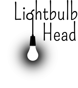
Last January I made my official move into graphic design by setting up Lightbulb Head as a business and becoming a freelancer. Full of flare and enthusiasm for this new venture, I started to think about how I might apply suitable branding to my business and I set to work designing a logo. I pondered long and hard, sketched out countless ideas and even experimented with new techniques, but found myself continuously dissatisfied with the results. I’ll admit that I’m an outright perfectionist with no desire to be cured, which can be both a hindrance and a help in my line of work, but the main spanner in the works at the time was that Lightbulb Head had only just been born and was yet to show its identity – I couldn’t quite pin down what visual form it should take.
Before long, the projects poured in and I ran out of time to work on my own design and branding. The logo remained a half-cooked plan and got shoved to the back of my to-do list… until now.

Perhaps driven by the dawning of a brand new year, or perhaps by my proactive husband (who is actually my polar-opposite when it comes to procrastination… we make a good team!), we’re proud to announce the completion of Lightbulb Head’s new logo.
The idea of simply using the image of a light-bulb hanging by its cable came to us once many of our more complicated ideas had been thrown out. Light is actually a very basic and fundamental thing and we decided we’d like to try and reflect this (our ethos) in our branding. The logo really sprang to life when we applied the font ‘Pompiere’ by Sorkin Type Co, its lengthy ascenders echo the image of the cable beautifully and could be interpreted as long shadows cast by the light-bulb.
The image below shows 5 different versions of the logo and 1 icon, so that it is equipped for every circumstance. Source ‘B’ is our favourite as it shows the characteristics of light (dramatically piercing the the darkness) most accurately.
All in all, we’re very pleased with the result, but there’s lots of branding work still to be done so we’d better crack on.
